Brand guidelines
The SENTORA logo, symbol, colours and typography. Original files, and the rules for using them.
Writing the name
The brand name is always set in capitals. In running text it is never rendered in small caps or mixed with other type styles.
Operated by: SENTORA ONE s.r.o., IČO 29850746
Logo variants
The logo is purely typographic: Montserrat Light capitals with 0.18em tracking. Never reset it in your own font. Always use the original file from this page.



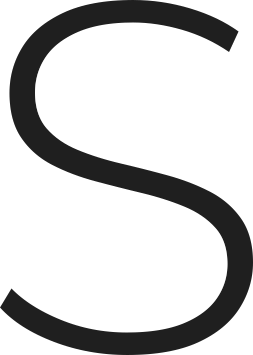
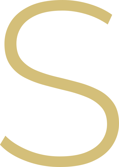
The S monogram
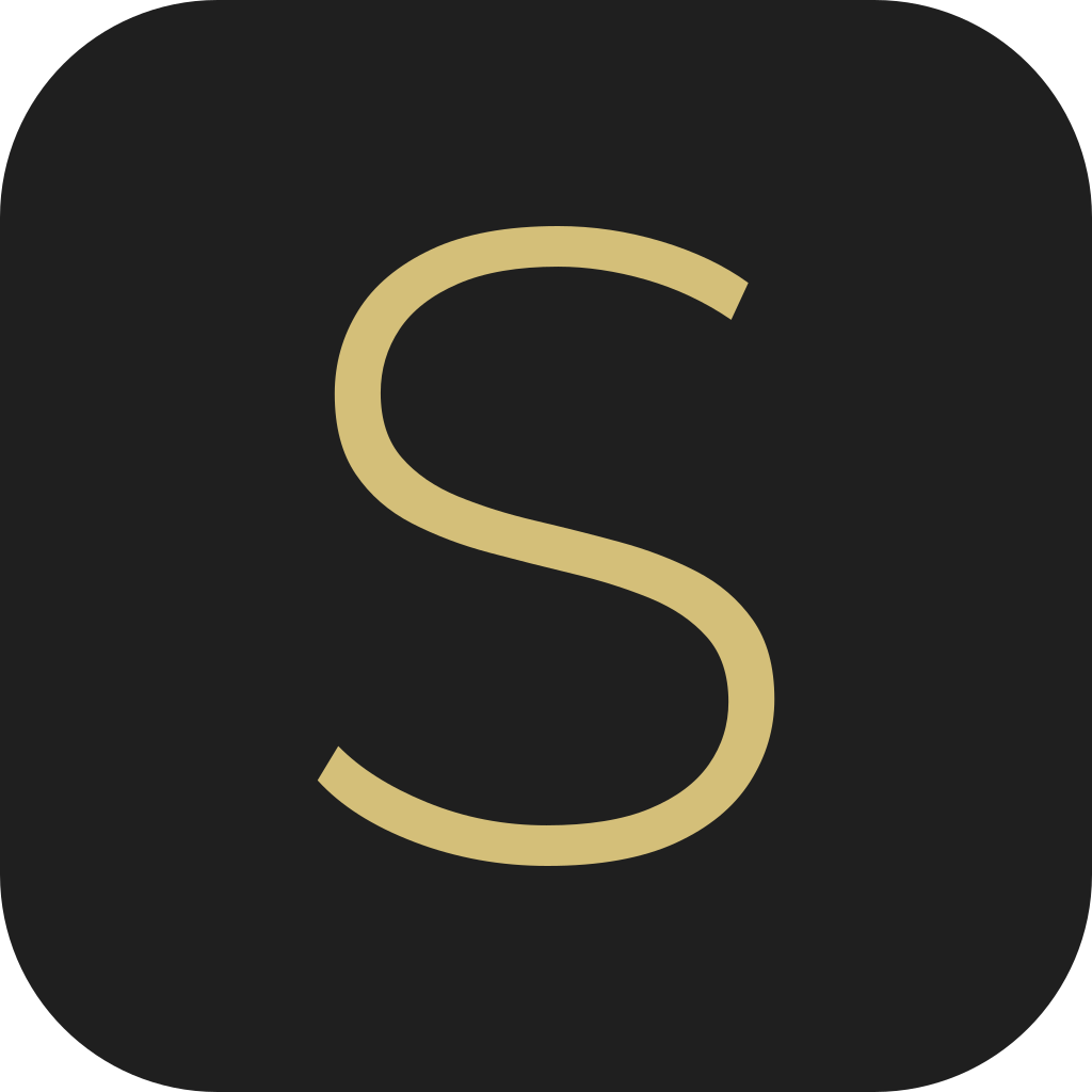
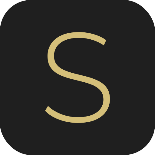
The monogram is the short form of the brand, for places the full logo cannot go: favicons, app icons, profile pictures, embossing on packaging.

Clear space and minimum size
Always leave clear space around the logo equal to the height of the letter S. No text, image, edge or other logo may enter that zone.

Clear space = height of the letter S (X)
On screen never scale the logo below 120 px wide, in print below 25 mm. The monogram on its own never goes below 24 px.
- Screen
- 120 px wide
- 25 mm wide
- Monogram
- 24 px
Colour palette
Three colours carry the brand: black, gold and white. The rest are supporting tones that separate surfaces, rules and interface states.
Gold is reserved for accents and buy buttons. Never use it for longer text or as a fill for large areas.
Brand typefaces
The brand runs on two typefaces. Montserrat Light carries the logo, Instrument Sans carries everything else. Both are available free from Google Fonts.
Weight 300, capitals, 0.18em tracking
Body at 400, headings at 600, line height 1.5 to 1.75
Using the brand
- Use the original files downloaded from this page.
- Keep the clear space and the original aspect ratio.
- Pick the logo variant that contrasts with the background.
- Stay within the defined colour palette.
- Always write the brand name in capitals: SENTORA.
- Don't recolour the logo outside the defined palette.
- Don't stretch, rotate or crop the logo.
- Don't add shadows, outlines, gradients or other effects.
- Don't place the logo on a photograph without enough contrast.
- Don't reset the logo in your own typeface or change its tracking.
The complete kit
Every logo and monogram variant in SVG and PNG, in a single ZIP file.
Need another format?
Write to us and we will prepare the artwork at the resolution, colour space or print format you need.